Authentic
Imaginative
Emotive
Arresting
Defining & ideating the personality of a memorable brand.
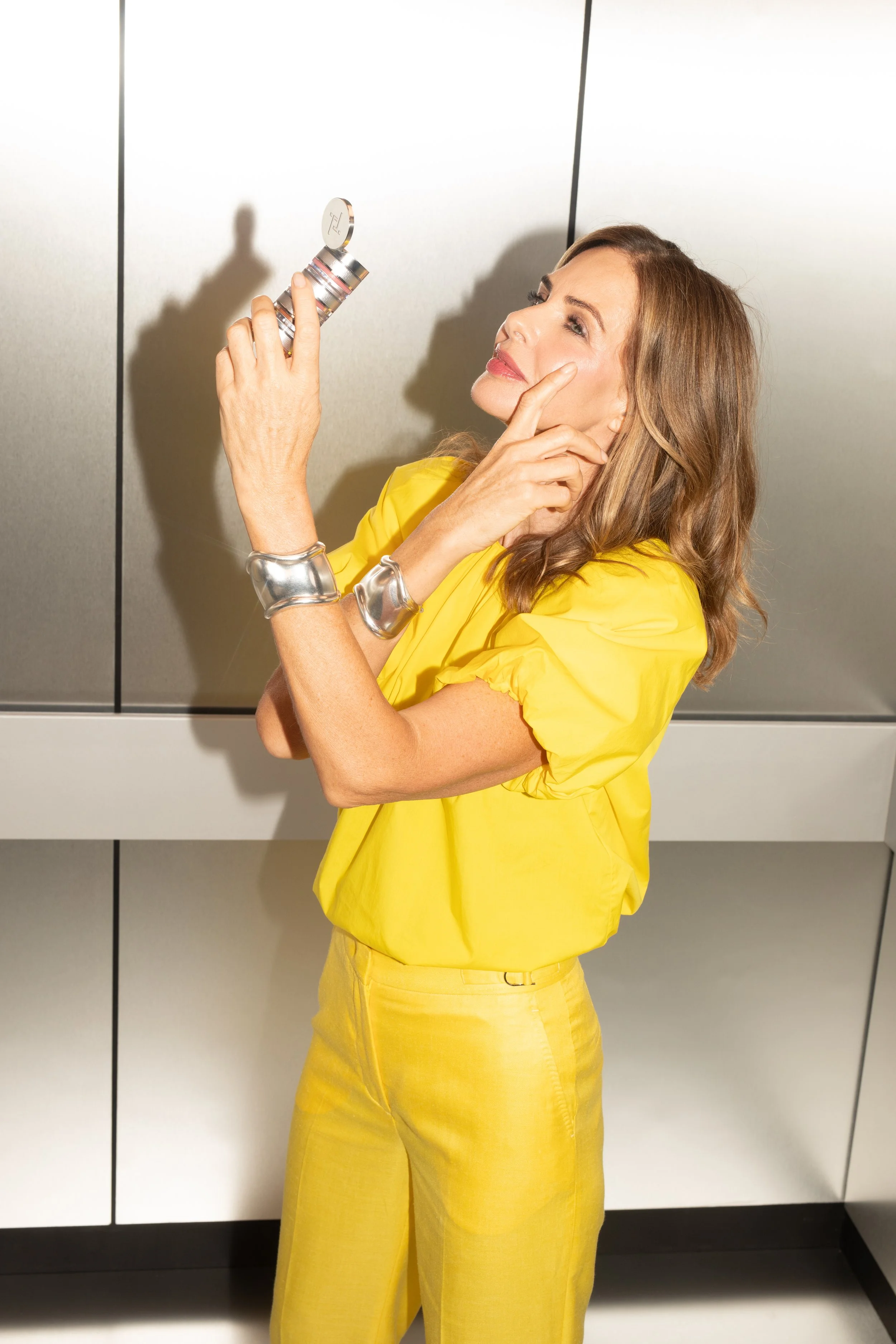
An in-house Creative Director role where my goal was to create visual consistency and elevate the Trinny London brand.
By analysing content resonating with the Trinny London audience, and using data-driven insights I shaped a strategic, professional brand direction. I crafted a distinctive, premium visual identity across all touch points, and you can see some of this vast project below…
APPROACH
I also streamlined the shoot process, aligned creative priorities, and refreshed core brand assets—product photography, model content, and video. To maintain quality and consistency, I developed a creative operations framework and implemented processes for visual language and asset approvals, supporting 200+ assets per monthly launch.
Drawing from Trinny Woodall’s fashion background, I infused the brand identity with an editorial and contemporary aesthetic, reflecting her experience in varied degrees across Trinny London’s new look
OVERVIEW
Fearlessly Feel Your Best Self




Core Brand Consistency
Refining our suite of core brand elements.
LOGO & TYPOGRAPHY
The backbone of a strong, memorable brand is consistency. I see consistent brand elements—like fonts, logos, and visuals—as the foundation of a cohesive identity. Refining these elements for Trinny London and using across all touchpoints builds better familiarity and trust, making the brand instantly recognisable. Allowing us to communicate more effectively and strengthen the emotional connection with our audience.
LOGO
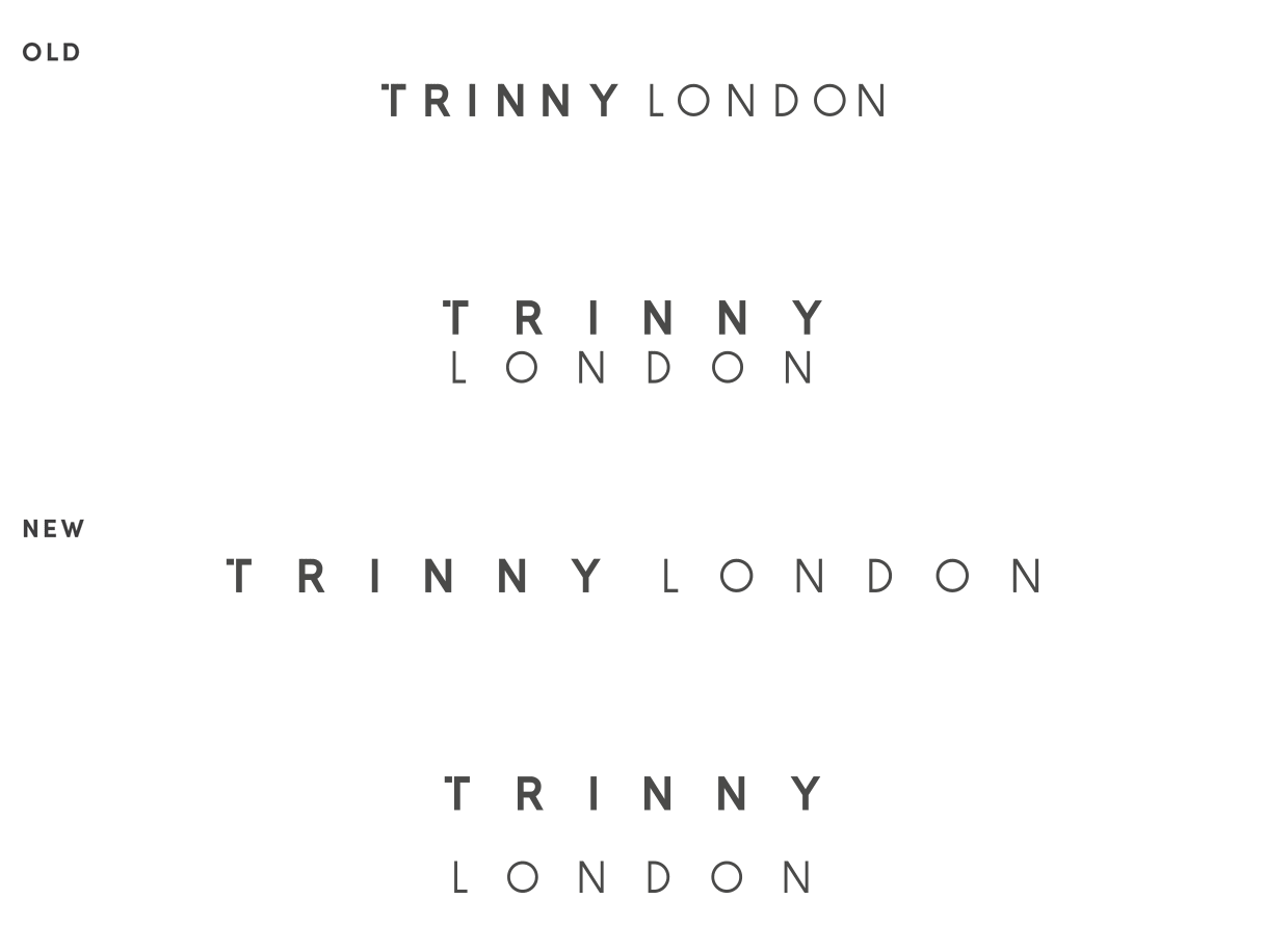
The Trinny London logo got a glow up. There were six different versions of the original logo and every one of them had different spacing. Depending on whether your first encounter was packaging, digital, print and retail you would get a different impression of our brand…
LOGO BUILD
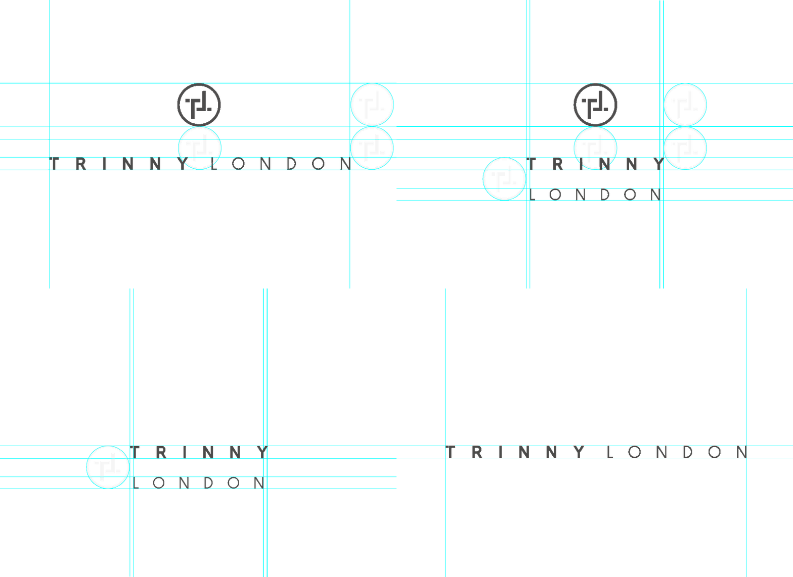
I created a suite of logos that formed the starting points of a long term project to align the company visually. Ensuring that there was enough flexibility across different scale packaging items, line density, print tolerance etc.
PACKAGING
The most important application of our logo was on our packaging. Below is a 24-36 month projection of updating our product line up, displaying a sleeker and more refined look.


TYPOGRAPHY
The choice of font is as important as what is done with it. I rolled out the inclusion of a secondary font. While our sans-serif font maintains its role as the foundation of our clean and modern aesthetic, the new serif font brings an elevated fashion editorial vibe to our branded content.

MAIN FONT
FOR HEADERS & BODY COPY

SECONDARY FONT
FOR HERO INFORMATION
TAGLINE
Our new tagline, 'Fearlessly Feel Your Best Self,' evolves our mission by emphasizing empowerment, authenticity, and confidence. Building on 'Be Your Best,' it encourages unapologetic self-expression and feeling good from within, reflecting our dedication to individuality and fearless self-celebration

Colour fingerprint
A signature colour scheme that runs consistently across all core products and brand assets.
COLOUR
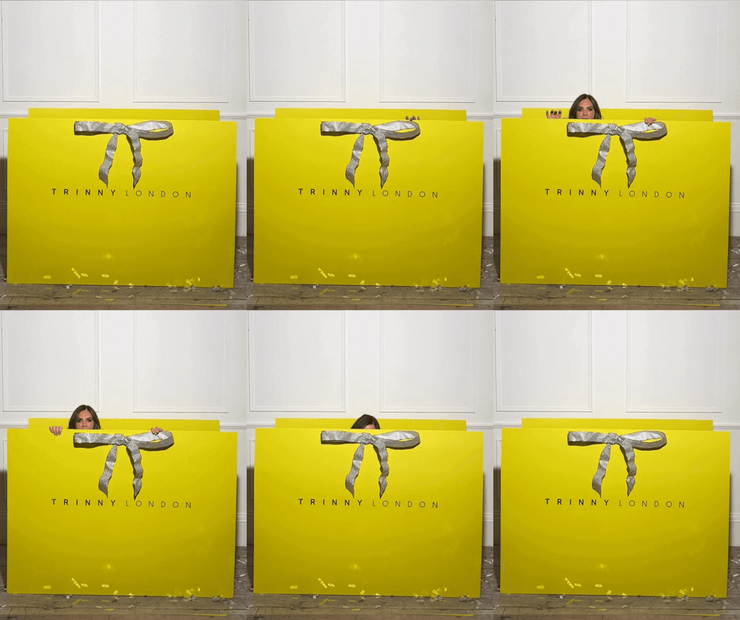
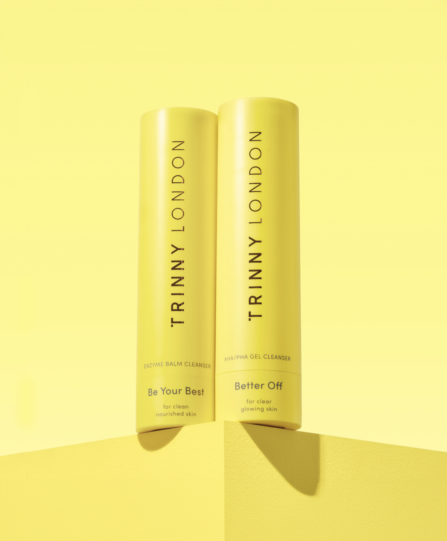
To reinforce Trinny London's identity, I consistently incorporated our signature, contemporary, lemon-yellow across graphics and photography, with variations of texture and finishes across packaging and materials.


Art Direction
Revitalising model stills and video to represent a more contemporary direction.
CORE BRAND VISUALS
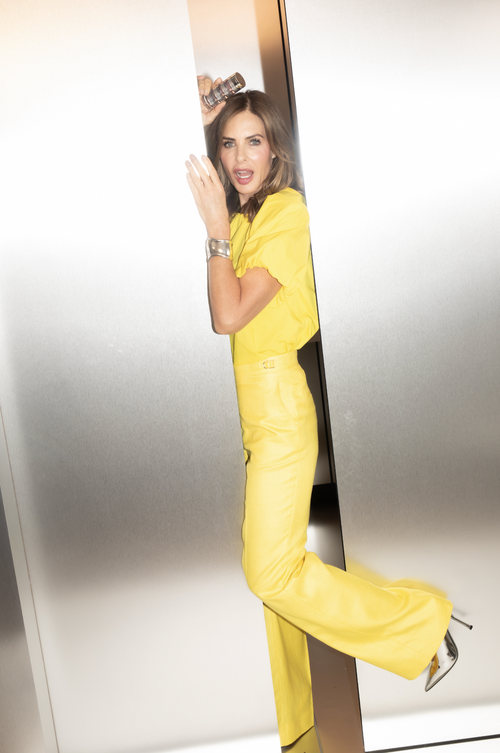
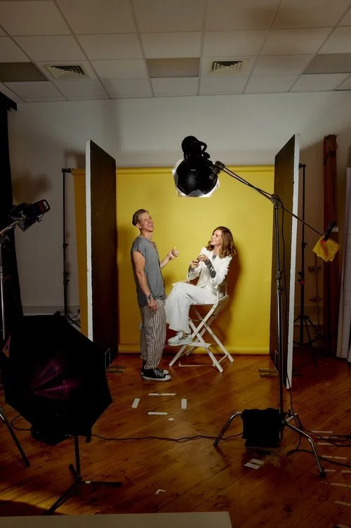
I infused Trinny London’s aesthetic with a editorial feel, reflecting Trinny’s expertise while addressing market demand for authenticity and craft amidst an era of overly retouched beauty imagery. Including behind-the-scenes moments and a candid feel.


CAPTURE STYLE
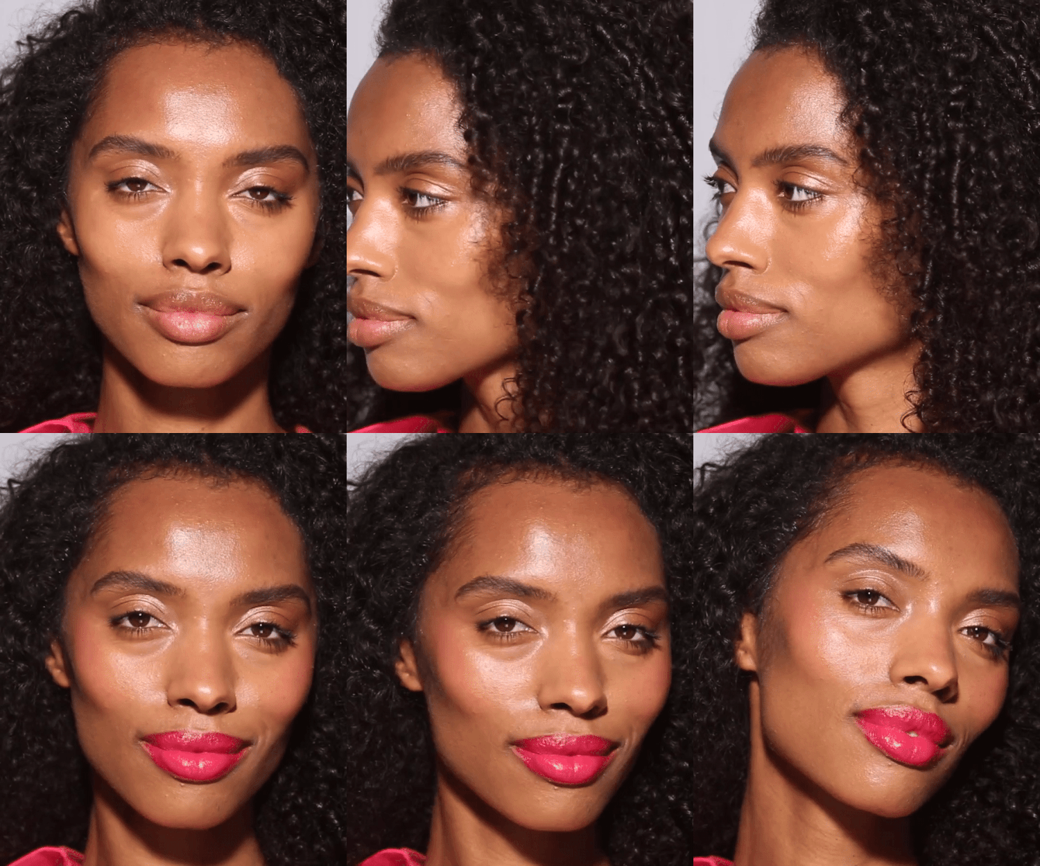
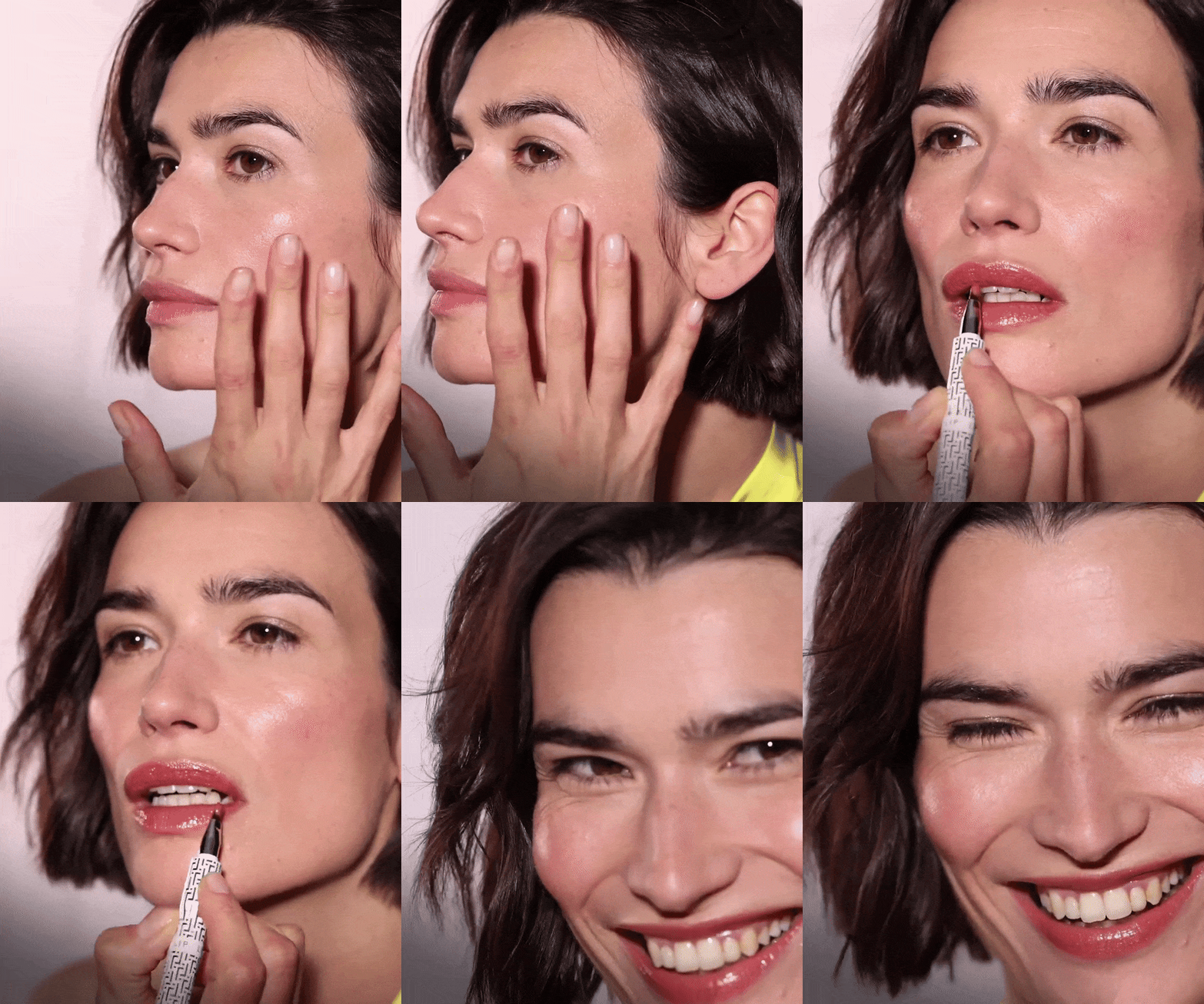
Implementing an editorial look and feel to our photography and video assets, the aim was to develop a visual direction that felt honest, candid, and playful. Finding a photography style that required the less retouching the better, and above all else, content and captures that displayed true, not staged, emotion. The joy of Trinny London, with a fashion feel.





NO-TO-LOW RETOUCHING
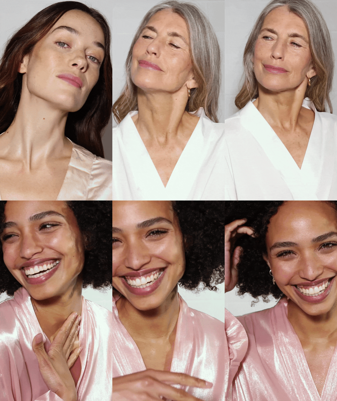
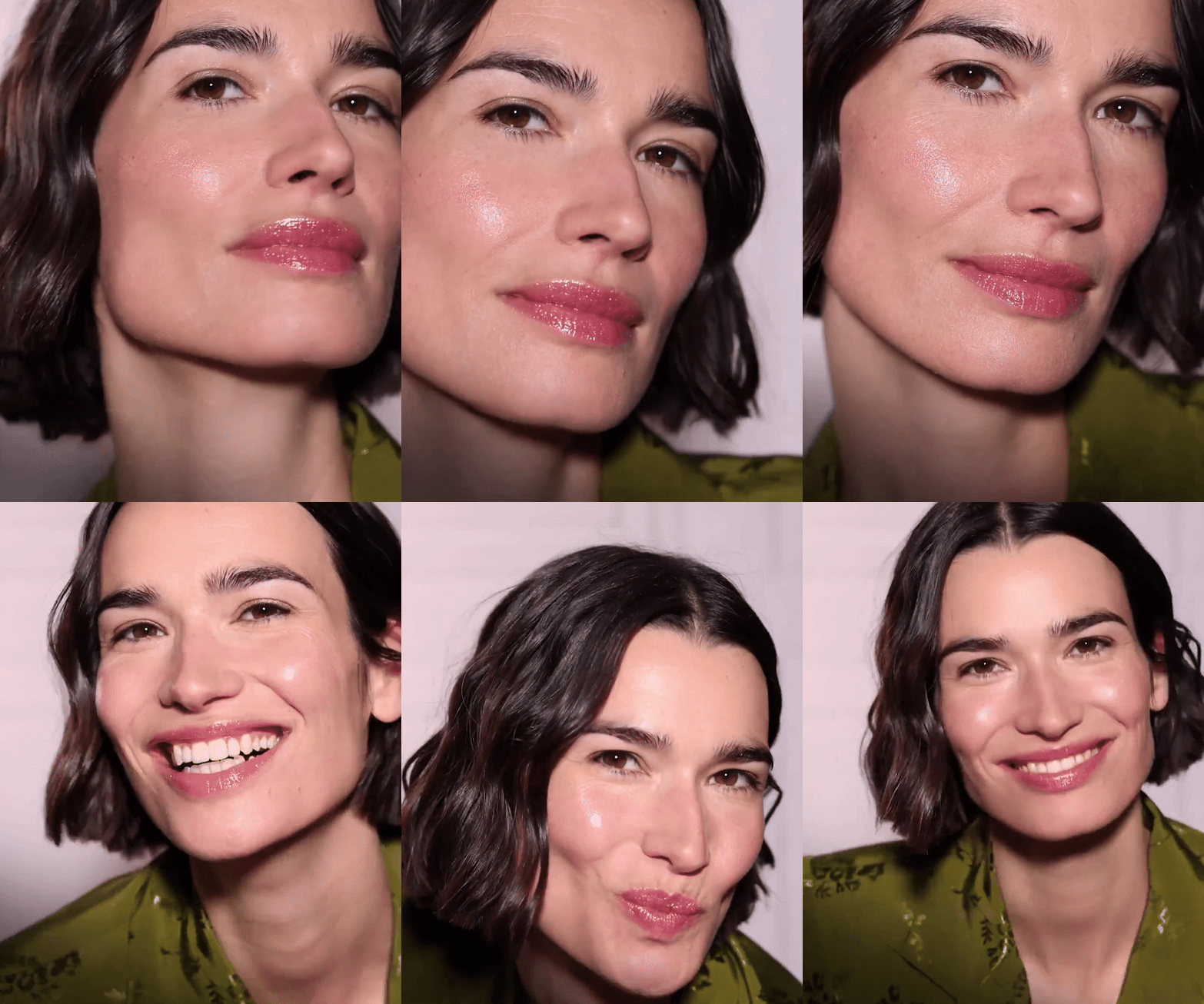
Minimal retouching in model photography. Promoting authenticity, showcasing real beauty and encouraging inclusivity. It highlights natural features, boosts confidence, and challenges unrealistic beauty standards created by excessive editing.

EMOTIONS & AUTHENTICITY
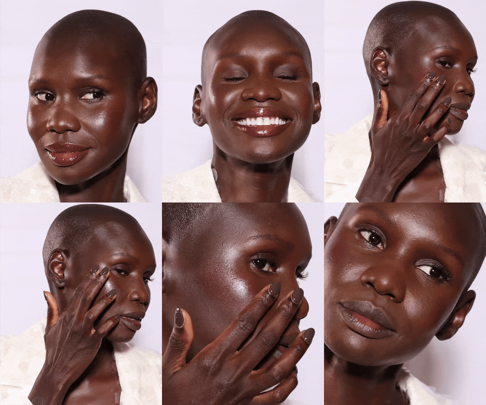
Displaying authentic, unscripted moments to create a more genuine connection with our audience. We tried to capture the true essence of the model, making our content feel relatable and human, helping to build trust and authenticity in the brand.
STYLING
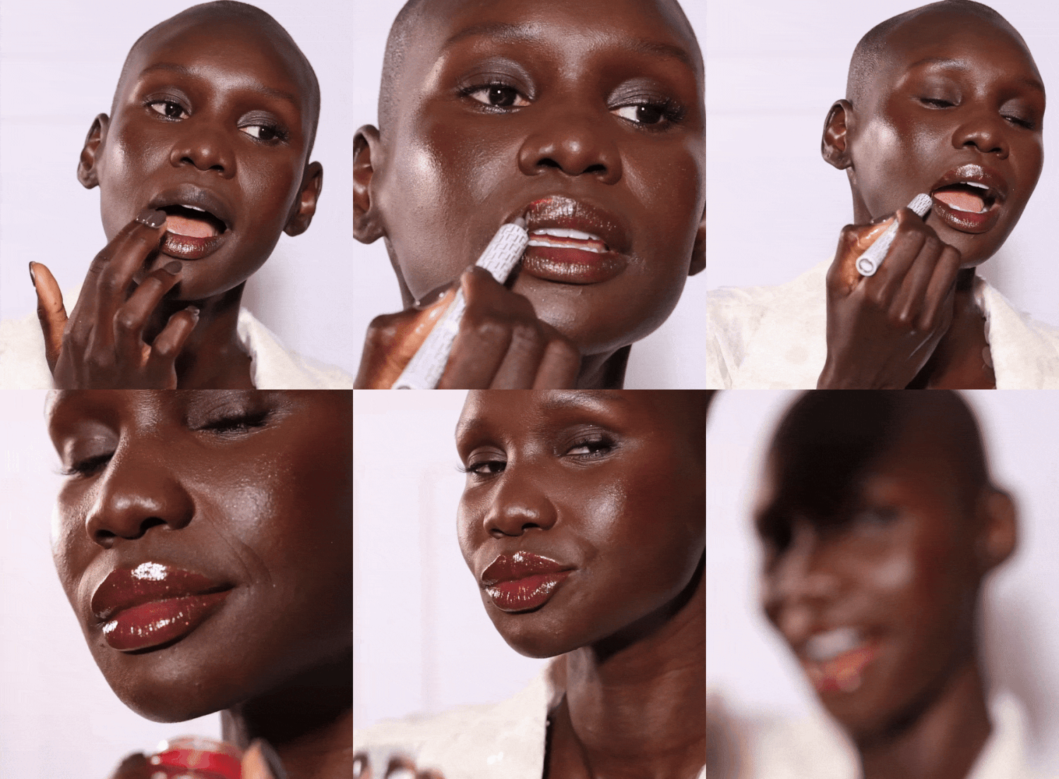
Instead of the typical white t-shirt or cami, I brought fashion into the brand by styling models in outfits and varying their hair and makeup. This showcased how easily our products can transform looks, from desk to dancefloor!


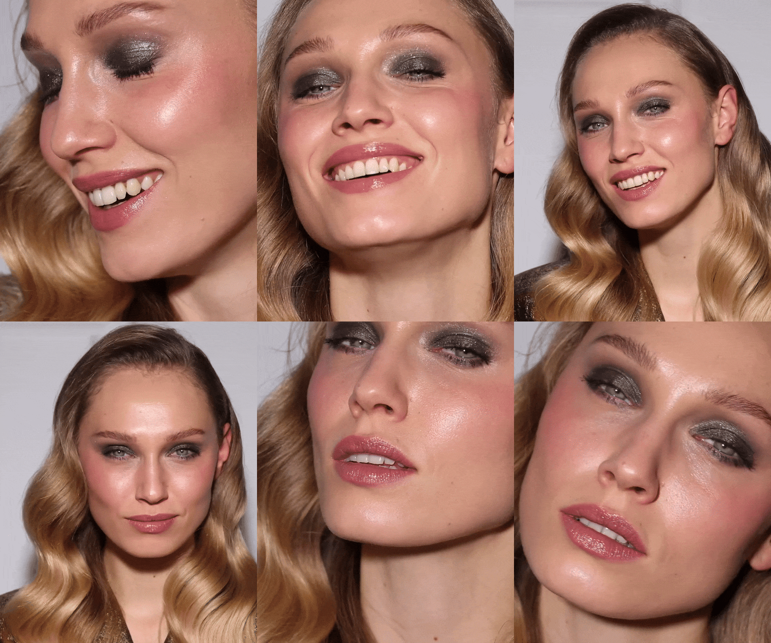
SKINCARE & BEAUTY
Using the same models in different looks allowed our audience to see how the Trinny London products transform the appearance of the same face across content.

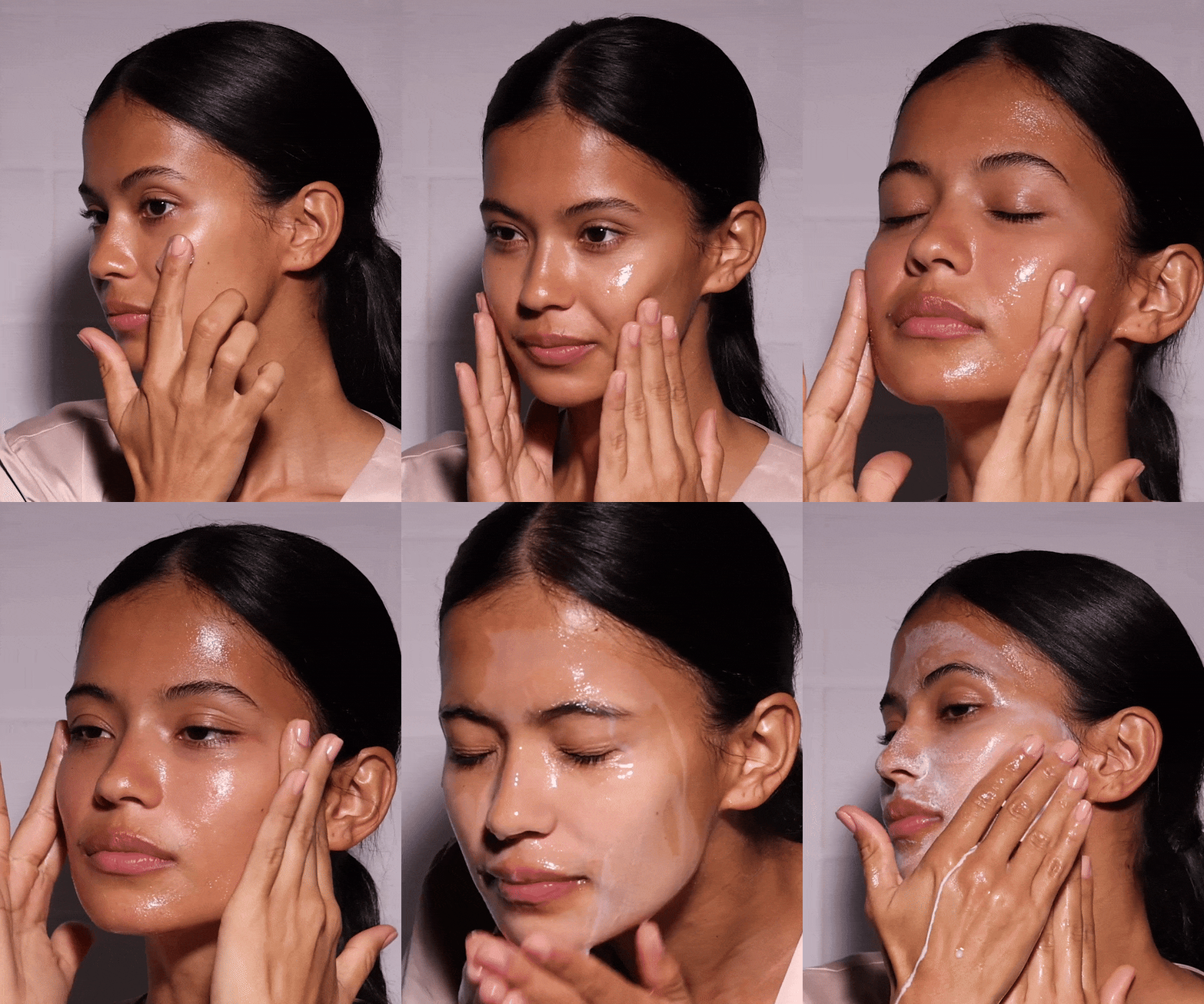
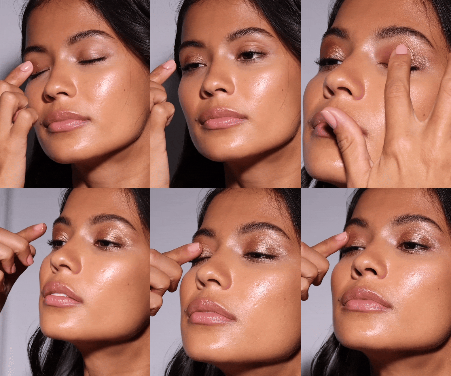
INCLUSIVITY
Showcasing a diverse range of models in beauty content is essential for promoting inclusivity and reflecting a broader spectrum of beauty. It allows our audience to see themselves in the brand, creating a stronger sense of authenticity and connection.


Product
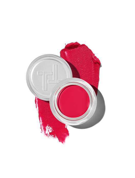
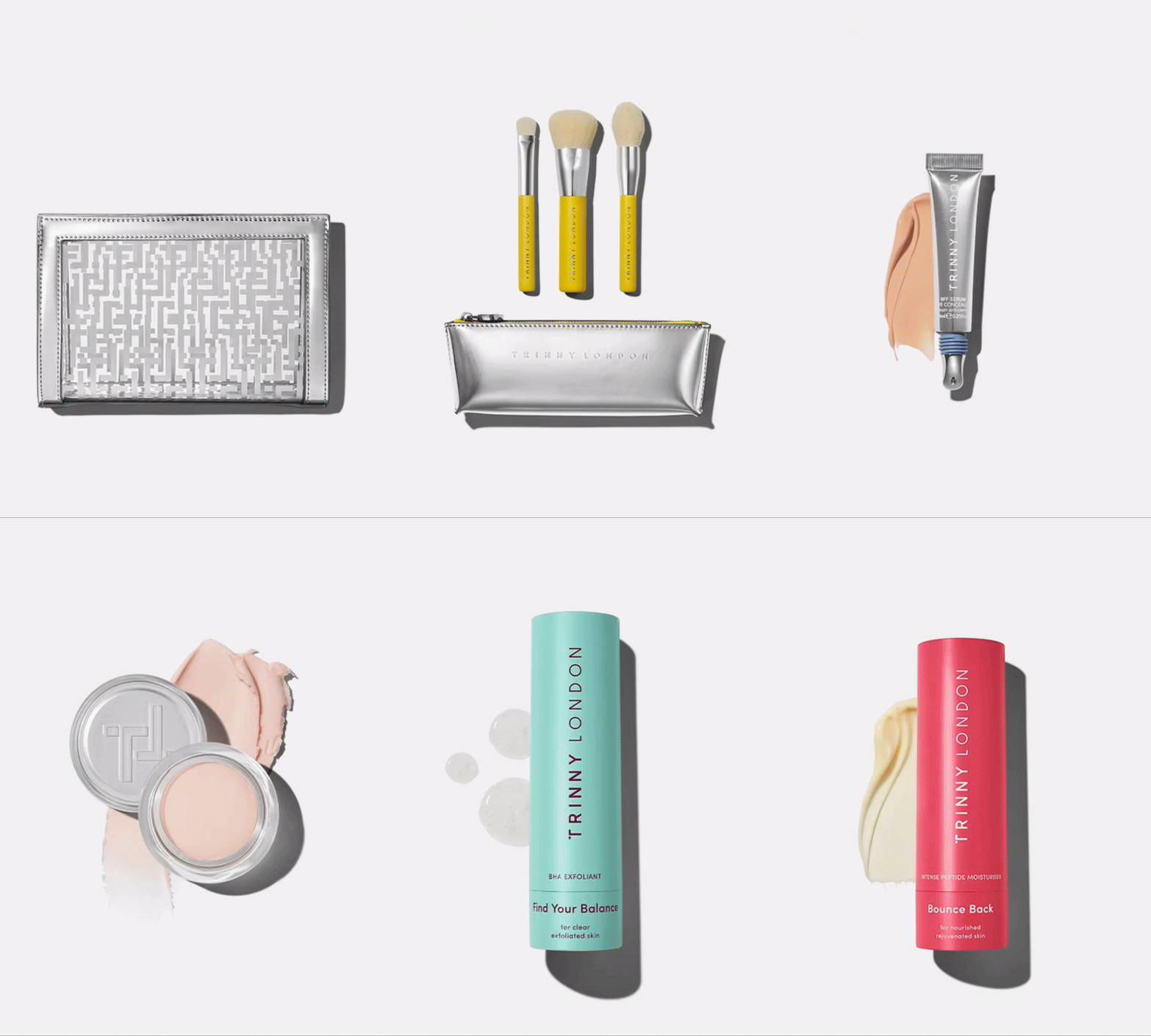
A bright, clean & premium refresh for all product photography and swatches.
CORE IMAGERY
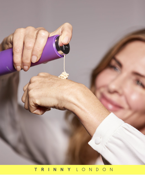
I refreshed our product photography to highlight texture, vibrancy, and the high-quality finish of our packaging, combining sophistication with a fashion twist, in some cases photographing products over garments, while showcasing the authenticity and performance of our formulas.






Retail Direction
Timeless yet playful. Vibrant yet inviting. Simple, yet memorable. The essence of ideating the Trinny London retail look & feel.
RETAIL DEVELOPMENT
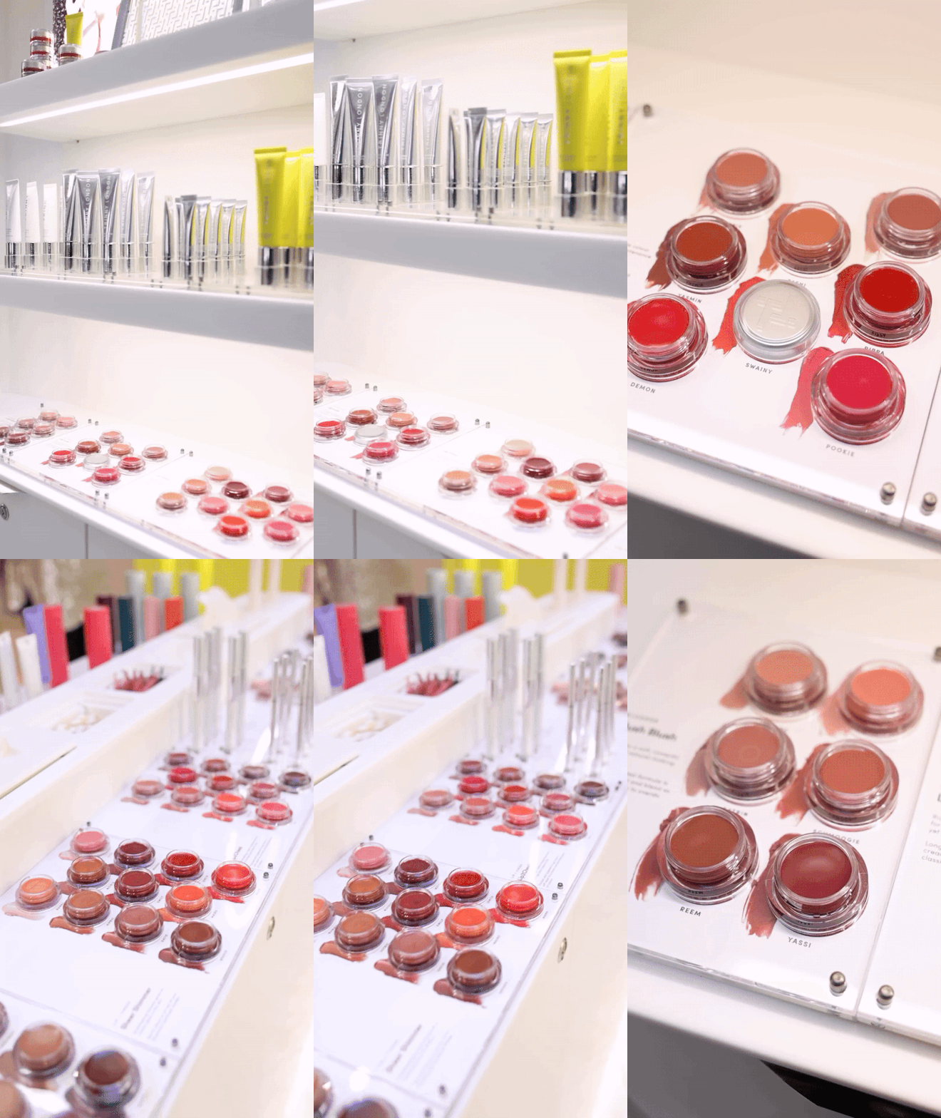
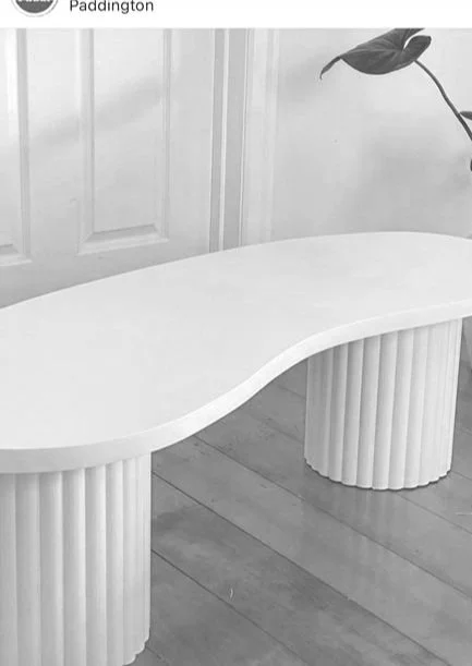
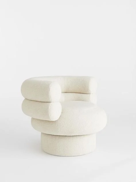
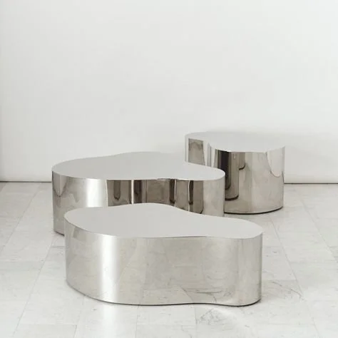
Identifying key visual and structural elements that formed the DNA of our stores aesthetic. The application of these ideas differed by space and limitations, but the materials and overall feel stay consistent across all Trinny London retail spaces from pop-up to flagship.





RETAIL FURNITURE
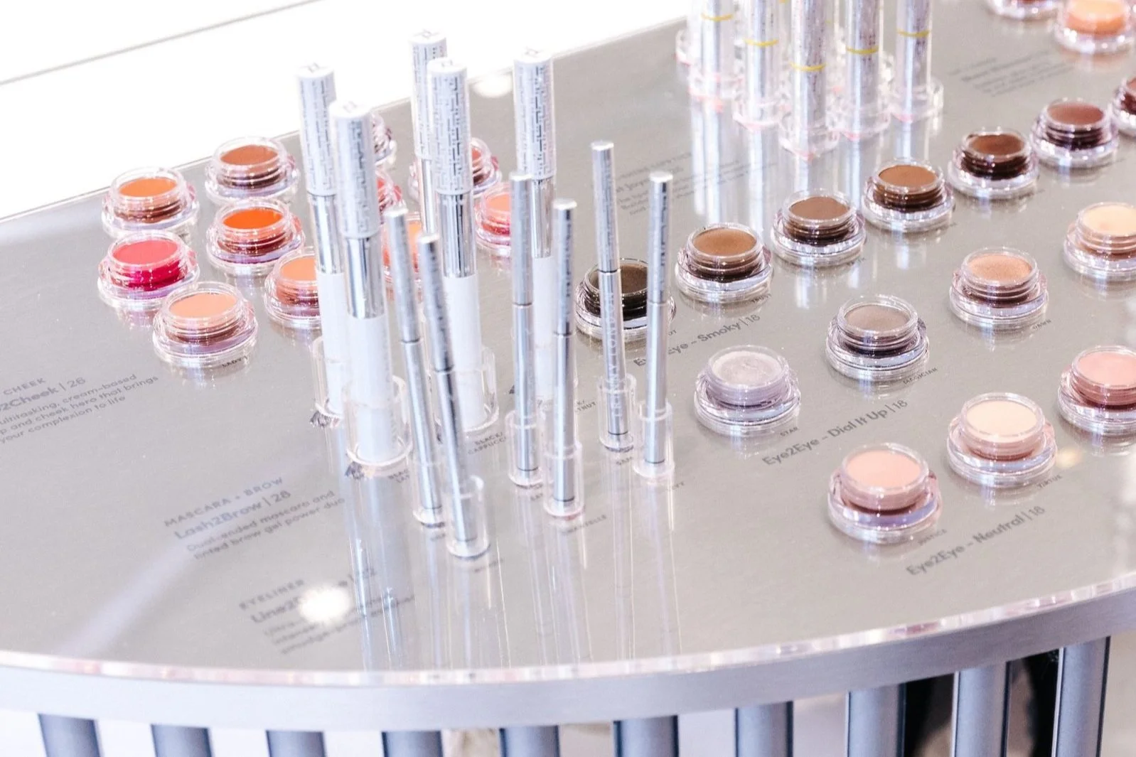
I designed Trinny London’s modular plates to easily adapt to product updates and new launches. The result is clean, contemporary retail furniture that enhances product navigation and offers educational touchpoints for self-selecting customers.


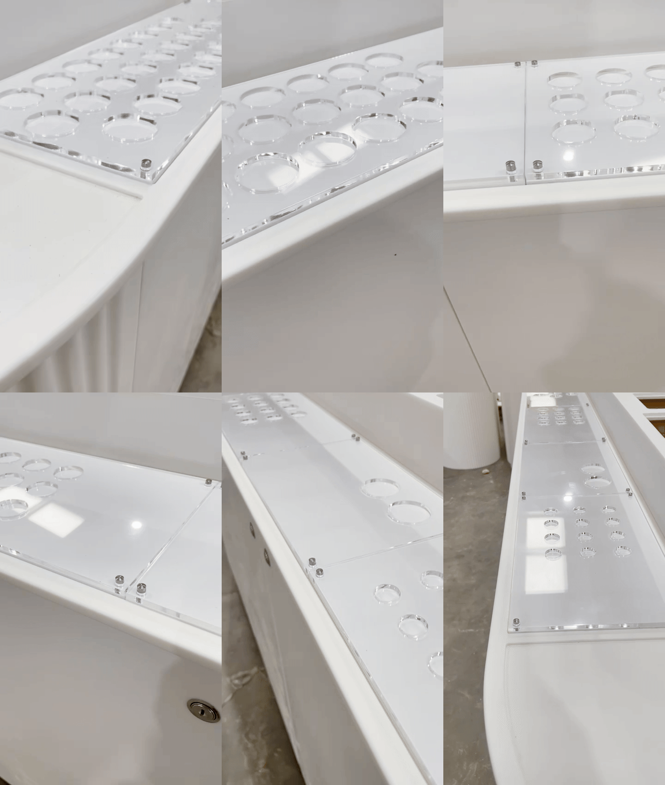
KING’S ROAD FLAGSHIP
The Chelsea in Bloom pop-up, which became our first flagship store, blends core retail elements with elevated features. It offers a luxurious space for beauty and skincare consultations, alongside a destination for shoppers to explore the full product range.


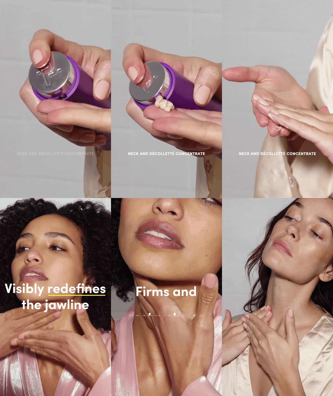
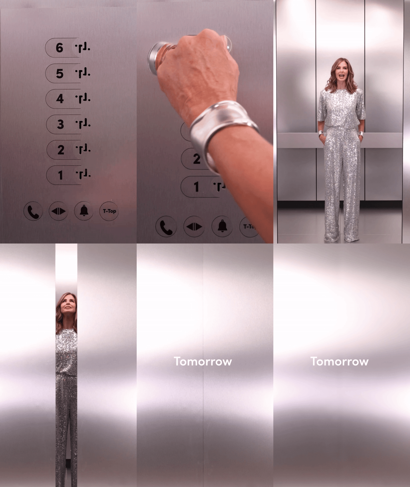
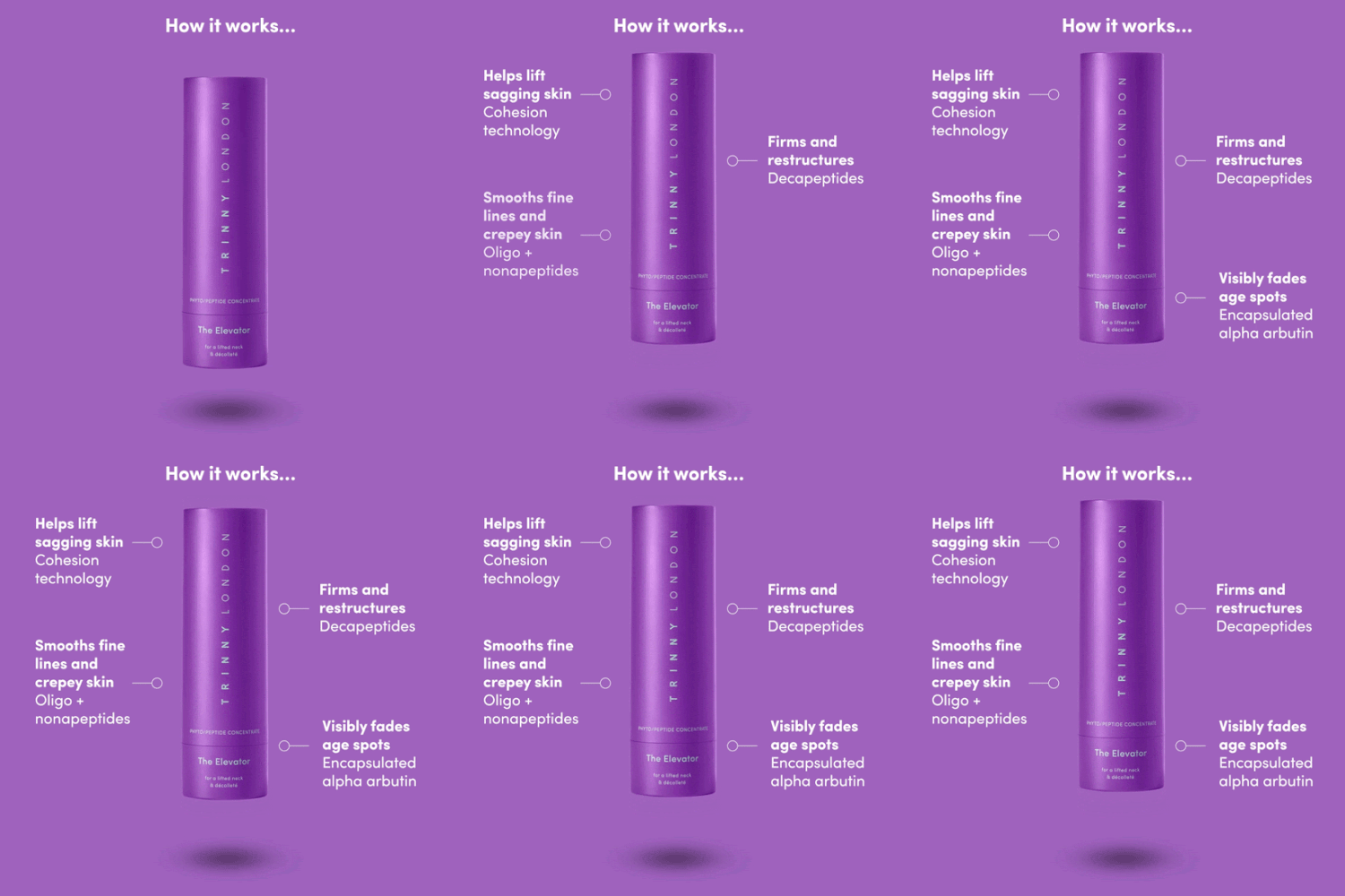
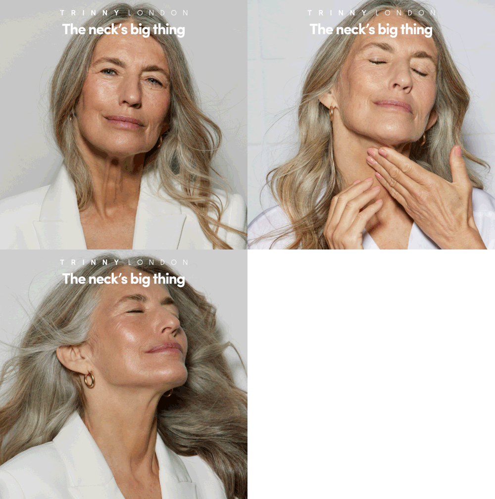
Trinny London Campaign - ‘The Elevator’ Neck & Décolleté Moisturiser
A highly technical shoot to match the impressive science behind a high-performance skincare product.
CONCEPT
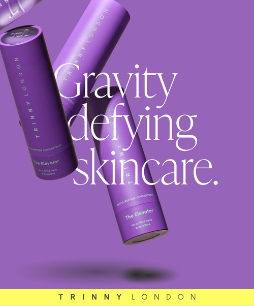
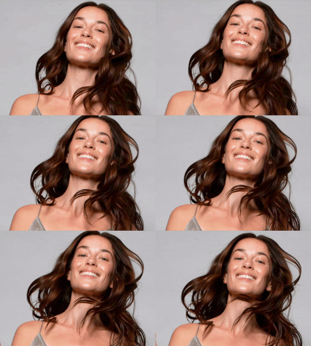
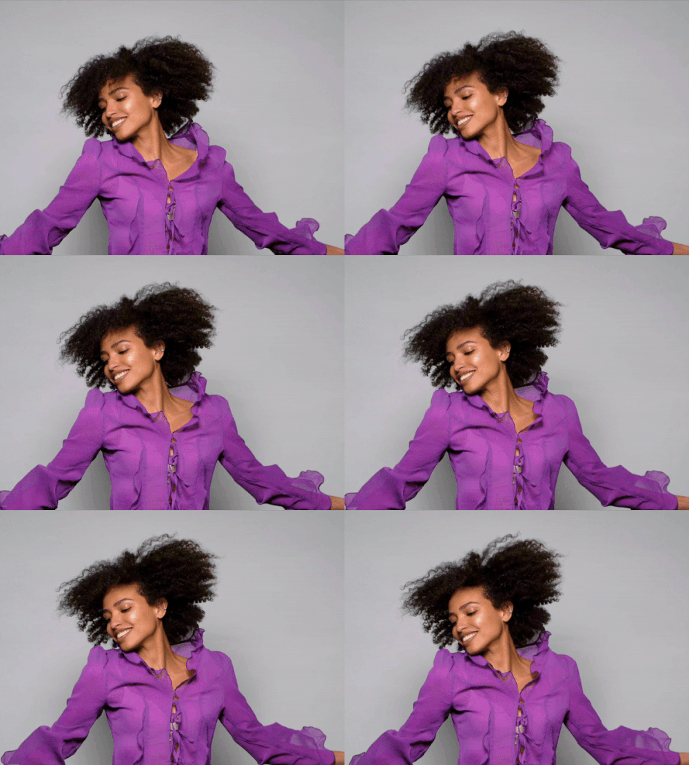
To showcase The Elevator’s lifting and tightening formula, my concept embraced the theme of defying gravity.
We filmed models jumping on trampolines at 1000fps, capturing just half a second at their peak to create a moment of zero gravity.
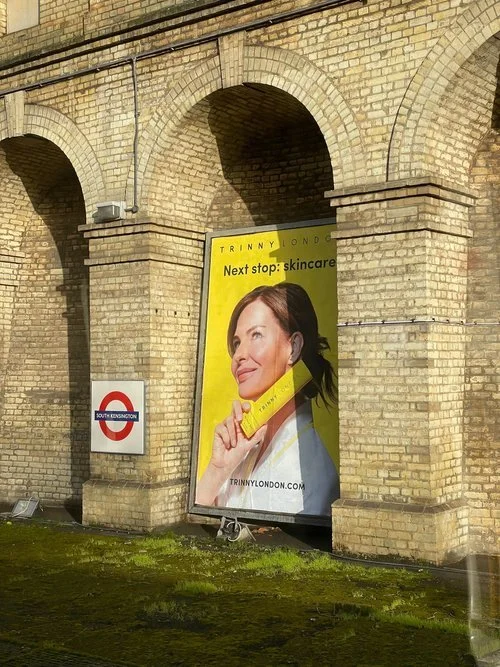
This creative campaign extends across performance marketing, OOH ads like Underground banners and billboards, infographics, and digital platforms including websites and social media.





In Application - ‘Millie’ Lip2Cheek
A joyful colour campaign and also an introduction to the refreshed Trinny London brand direction.
OVERVIEW
Milly Lip2Cheek. Easily the brightest, most contemporary shade of colour, in Trinny London’s assortment of stackable lip products… we created impactful creative assets that focussed on colour and texture.
When it launched early in 2022, it was also the first campaign launched with the new photo and video and feel, a beautiful, simple, introduction to the new core brand look and feel.

